Blur Materials
Pre-built blur style implementations that match common design systems.
Download

repositories {
    mavenCentral()
}

dependencies {
    implementation("dev.chrisbanes.haze:haze-blur-materials:<version>")
}
HazeMaterials
Implementations of Material Design blur styles, inspired by SwiftUI Material APIs. These don't attempt to replicate exact iOS effects, but rather provide pleasant blur styles compatible with Material Design.
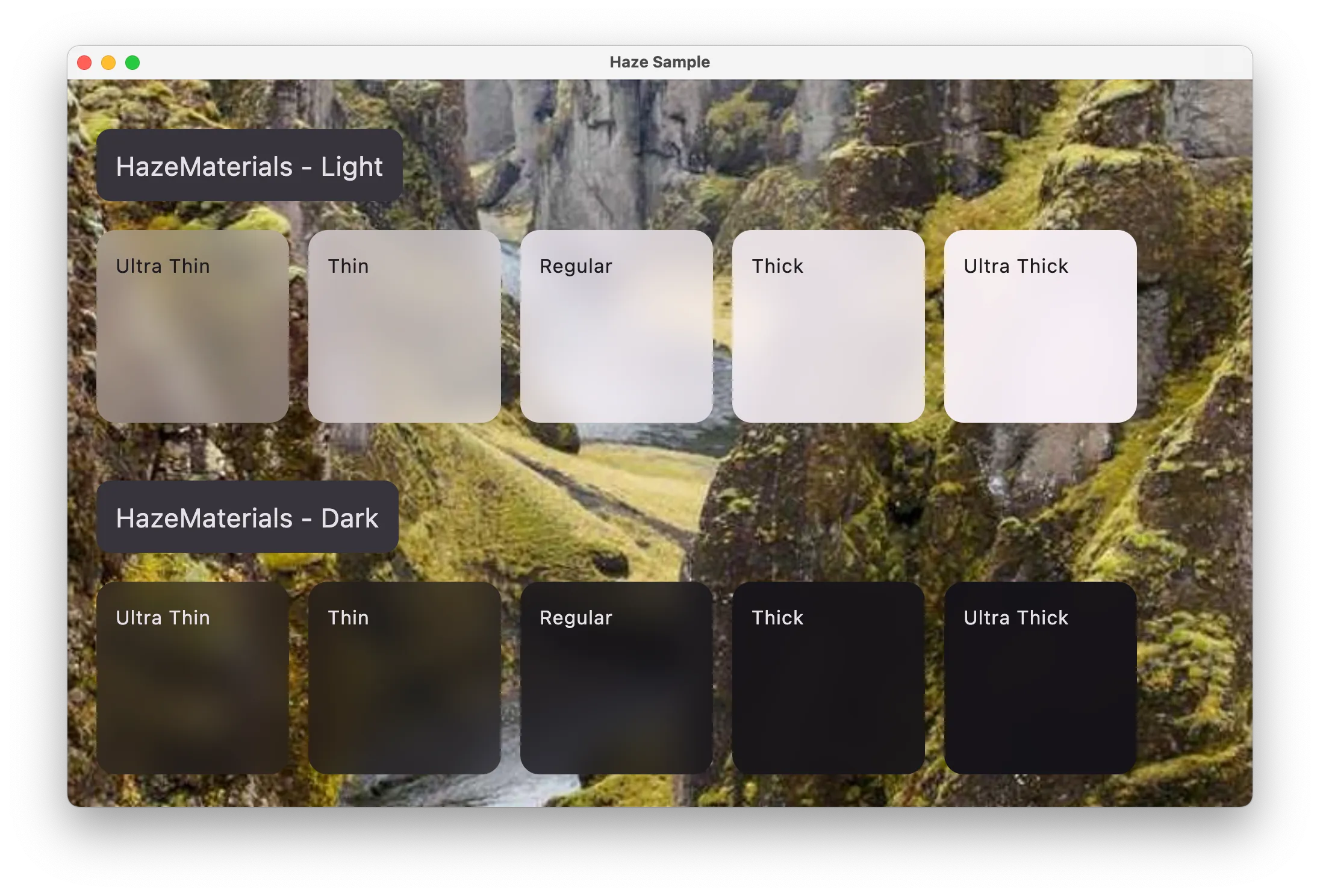
Class reference: HazeMaterials.
Usage
Box {
  LazyColumn(
    modifier = Modifier.hazeSource(state = hazeState)
  ) {
    // content
  }

  TopAppBar(
    modifier = Modifier.hazeEffect(state = hazeState) {
      blurEffect {
        style = HazeMaterials.thin()
      }
    }
  )
}
Available levels: thin(), regular(), thick(), and more.
CupertinoMaterials
Blur styles matching Apple platforms (iOS, macOS). Values are taken from the iOS 18 Figma file published by Apple.
Use these for consistency when mixing Compose Multiplatform with SwiftUI.
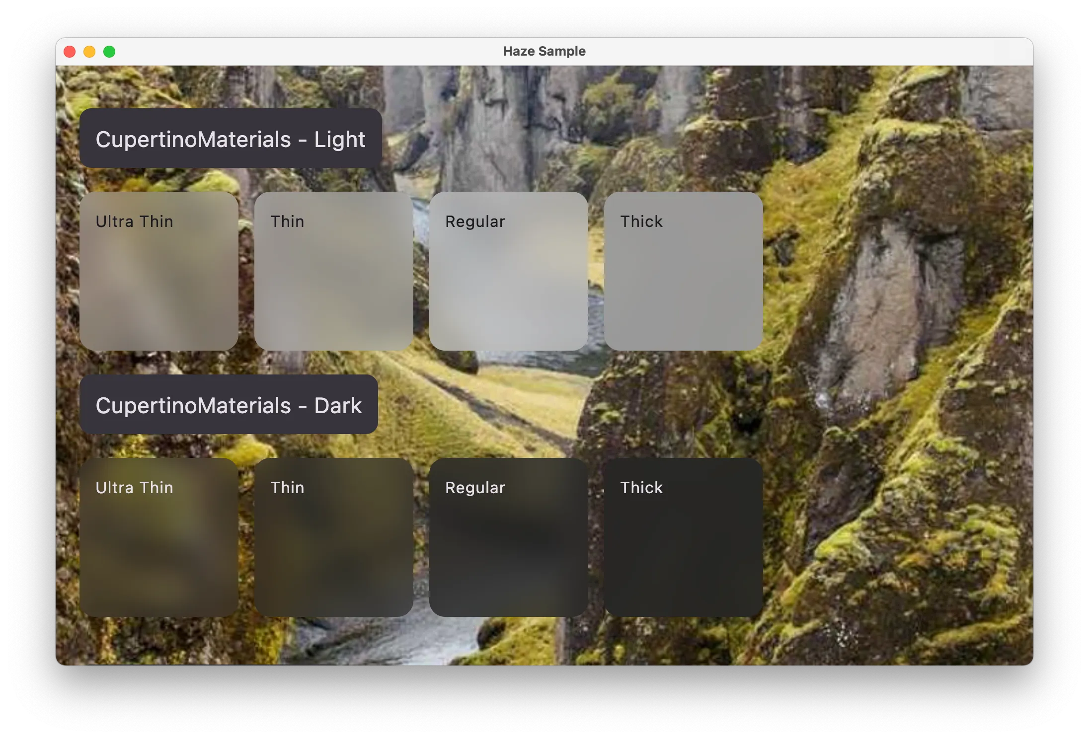
Class reference: CupertinoMaterials.
Usage
blurEffect {
  style = CupertinoMaterials.thin()
}
FluentMaterials
Blur styles matching Windows platforms (WinUI 3). Values are taken from the WinUI 3 Figma file published by Microsoft.
Use these for consistency when mixing Compose Multiplatform with WinUI.
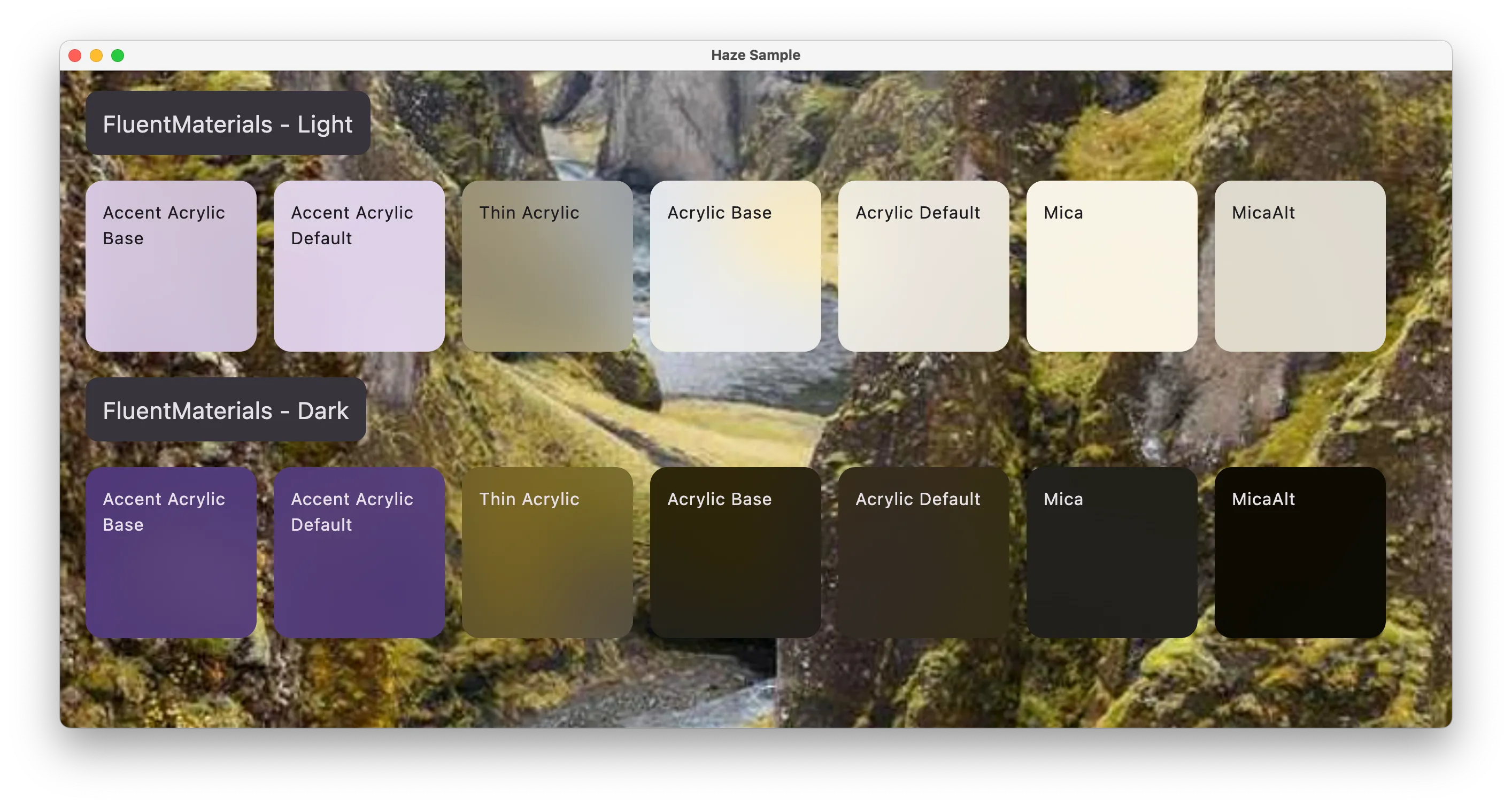
Class reference: FluentMaterials.
Usage
blurEffect {
  style = FluentMaterials.thin()
}
Custom Styles
To create custom blur styles, use the HazeBlurStyle data class:
val customStyle = HazeBlurStyle(
  blurRadius = 15.dp,
  colorEffects = listOf(HazeColorEffect.tint(Color.Black.copy(alpha = 0.2f))),
  noiseFactor = 0.1f
)

blurEffect {
  style = customStyle
}
Or set properties directly in the blurEffect block:
blurEffect {
  blurRadius = 15.dp
  colorEffects = listOf(HazeColorEffect.tint(Color.Black.copy(alpha = 0.2f)))
  noiseFactor = 0.1f
}