Blur Usage
This guide covers the blur effect in detail, including all available features and patterns.
Modes
Blur works in two modes: 'background blurring' and 'foreground blurring'. Both modes use the same APIs and features, with the main difference being whether you need a HazeState.
Background Blurring (Most Common)
Blurs content from elsewhere in the UI that's marked with hazeSource:
val hazeState = rememberHazeState()

Box {
  LazyColumn(
    modifier = Modifier
      .fillMaxSize()
      .hazeSource(state = hazeState)
  ) {
    // scrollable content
  }

  TopAppBar(
    modifier = Modifier
      .hazeEffect(state = hazeState) {
        blurEffect {
          style = HazeMaterials.thin()
        }
      }
      .fillMaxWidth(),
  )
}
Foreground Blurring
Blurs the content within the composable itself. No HazeState or hazeSource needed:
@Composable
fun HazeExample(modifier: Modifier = Modifier) {
  Box(modifier = modifier) {
    Foreground(
      modifier = Modifier
        .hazeEffect {
          blurEffect {
            style = HazeMaterials.thin()
          }
        }
        .fillMaxSize()
    )
  }
}
Styling
Blur appearance is controlled via the HazeBlurStyle class or properties in the blurEffect block:
Styles can be provided in multiple ways:
- LocalHazeBlurStyle composition local
styleproperty insideblurEffect {}block- Individual properties in the
blurEffect {}block
HazeEffectScope Lambda
The blurEffect block receives properties you can set dynamically:
TopAppBar(
  modifier = Modifier
    .hazeEffect(state = hazeState) {
      blurEffect {
        alpha = if (listState.firstVisibleItemIndex == 0) {
          listState.layoutInfo.visibleItemsInfo.first().let {
            (it.offset / it.size.height.toFloat()).absoluteValue
          }
        } else {
          1f
        }
      }
    },
)
Styling Resolution
Each styling property is resolved using the following precedence:
- Value set in
blurEffect {}block (if specified) - Value set via
styleproperty inblurEffect {}(if specified) - Value set in LocalHazeBlurStyle composition local
- Default value
Styling Properties
Blur Radius
Controls how strong the blur effect is. Defaults to 20.dp. Larger values may be needed to keep foreground control (text) legible.
blurEffect {
  blurRadius = 20.dp
}
Tint
A tint effect is applied primarily to maintain contrast and legibility. By default, the provided background color is used at 70% opacity. You can provide multiple color effects applied in sequence:
blurEffect {
  colorEffects = listOf(
    HazeColorEffect.tint(Color.Black.copy(alpha = 0.2f)),
    HazeColorEffect.tint(Color.Blue.copy(alpha = 0.1f))
  )
}
Noise
Visual noise provides tactility. Defaults to 0.15f (15% strength). Disable by setting to 0f:
blurEffect {
  noiseFactor = 0f  // Disable noise
}
Progressive (Gradient) Blurs
Progressive blurs vary the blur radius across a dimension. This effect is common on iOS:
Enable by setting the progressive property on HazeEffectScope:
TopAppBar(
  modifier = Modifier.hazeEffect(hazeState) {
    blurEffect {
      progressive = HazeProgressive.verticalGradient(
        startIntensity = 1f,
        endIntensity = 0f
      )
    }
  }
)
Linear Gradient
Vertical, horizontal, or custom-angle gradients:
progressive = HazeProgressive.verticalGradient(
  startIntensity = 1f,
  endIntensity = 0f
)

// or horizontal
progressive = HazeProgressive.horizontalGradient(
  startIntensity = 1f,
  endIntensity = 0f
)
Class documentation: HazeProgressive.LinearGradient
Radial Gradient
A gradient radiating from a center point:
progressive = HazeProgressive.RadialGradient()
Class documentation: HazeProgressive.RadialGradient
Custom Brush
Use any Brush as an alpha mask:
progressive = HazeProgressive.Brush(
  brush = Brush.verticalGradient(...)
)
Class documentation: HazeProgressive.Brush
Performance of Progressive Blur
Progressive blur comes with a performance cost. See the Performance page for benchmarks.
Quick summary: Android 13+ costs ~25% more than non-progressive. On Android 12 it's about 2x. Consider using masking below for better performance.
Masking
Apply any Brush as an opacity mask:
TopAppBar(
  modifier = Modifier.hazeEffect(state = hazeState) {
    blurEffect {
      mask = Brush.verticalGradient(
        colors = listOf(Color.Black, Color.Transparent)
      )
    }
  }
)
Mask vs Progressive
Masks fade the effect through opacity only and may not feel as refined as progressive blur. However, masks are much faster with negligible performance cost.
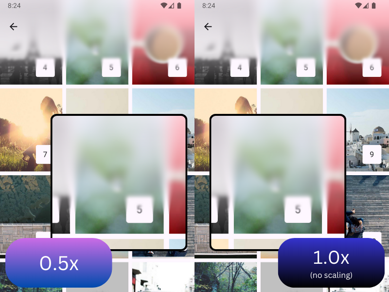
Input Scale
Optimize performance by rendering the effect at a lower resolution:
TopAppBar(
  modifier = Modifier.hazeEffect(state = hazeState) {
    inputScale = HazeInputScale.Auto
    blurEffect {
      // ...
    }
  }
)
HazeInputScale options:
HazeInputScale.None: No scaling (default)HazeInputScale.Auto: Automatic scaling with platform defaultsHazeInputScale.Fixed(...): Custom scaling factor (0.0 to 1.0)
Values less than 1.0 improve performance at the cost of quality. Common values:
- 0.66 - ~55% pixel reduction, imperceptible to most users
- 0.5 - ~75% pixel reduction, noticeable but often acceptable
- 0.33 - ~89% pixel reduction, likely visually different
Experimentation Recommended
Always benchmark with your specific styling parameters to find the right balance for your use case.
Overlapping Blurred Layouts
A layout can use both hazeEffect (drawing blur from other areas) and hazeSource (serving as a blur source for others):
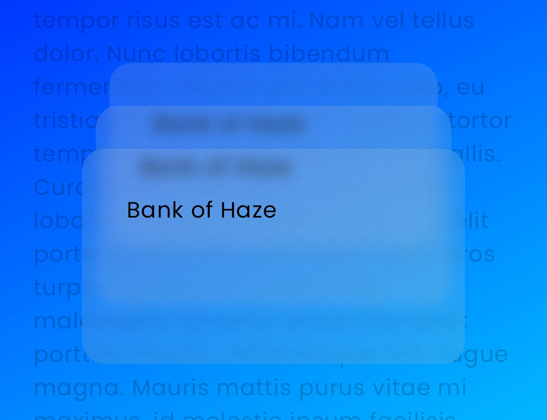
This enables overlapping blurred cards:
Box {
  val hazeState = rememberHazeState()

  Background(
    modifier = Modifier.hazeSource(hazeState, zIndex = 0f)
  )

  // Rear card
  CreditCard(
    modifier = Modifier
      .hazeSource(hazeState, zIndex = 1f)
      .hazeEffect(hazeState)
  )

  // Middle card
  CreditCard(
    modifier = Modifier
      .hazeSource(hazeState, zIndex = 2f)
      .hazeEffect(hazeState),
  )

  // Front card
  CreditCard(
    modifier = Modifier
      .hazeSource(hazeState, zIndex = 3f)
      .hazeEffect(hazeState)
  )
}
The zIndex parameter tells Haze which layers to draw. By default, a hazeEffect draws all layers with a zIndex less than its sibling hazeSource.
Filtering Areas
Control which layers are included via the canDrawArea filter:
CreditCard(
  modifier = Modifier
    .hazeSource(hazeState, zIndex = 2f, key = "foo")
    .hazeEffect(hazeState) {
      canDrawArea = { area ->
        area.key != "foo"  // Exclude self
      }
    },
)
Enabling Blur
Control whether blurring is active on individual effects:
blurEffect {
  blurEnabled = true  // or false to disable
}
Dialogs
You can blur dialog backgrounds over content. Important: Tints display as a scrim over background with dialogs, so use a translucent dialog background color instead:
val hazeState = rememberHazeState()
var showDialog by remember { mutableStateOf(false) }

Box {
  if (showDialog) {
    Dialog(onDismissRequest = { showDialog = false }) {
      Surface(
        modifier = Modifier
          .fillMaxWidth()
          .fillMaxHeight(fraction = .5f),
        shape = MaterialTheme.shapes.extraLarge,
        // Set translucent background instead of using tints
        color = MaterialTheme.colorScheme.surface.copy(alpha = 0.2f),
      ) {
        Box(
          Modifier.hazeEffect(state = hazeState) {
            blurEffect {
              style = HazeMaterials.regular()
            }
          },
        ) {
          // Dialog content
        }
      }
    }
  }

  LazyVerticalGrid(
    modifier = Modifier.hazeSource(state = hazeState),
  ) {
    // Background content
  }
}
Complete sample: DialogSample